


PlayOS
Tools
Procreate, Figma, Illustrator
Role
UX research & design
Team
6 members
Timeline
10 weeks
Identifying a problem
Children are using technology at an early age.
It’s apparent that technology is used by most people in the United States; it is engrained in our culture. Children begin using technology at ages earlier than ever. Did you know that 53% of children have phones by the age of 11?
It’s apparent that technology will be used by the younger generation as time continues. By creating an operating system focused on promoting healthy technology usage, the next generations will have a better foundation on how to properly approach technology.

Statistics say that parents think their children should get smartphones mostly after elementary school. Yet, 53% of children have phones in elementary school. It’s safe to say that children are going to be using technology at a young age. So this leads us to our proposal statement.

“We want to create an operating system that promotes healthy and educational use of technology for children.”
– the goal presented by my team.
Designing for kids is not child’s play.
Behavior
Children need more breaks than adults do
Children often become more upset more easily than adults
Children may need positive reinforcement at more regular intervals than adults to continue in their work
Rapid developmental differences in children result in an ideal 2-year range.
Interaction
In a virtual environment, we have the opportunity to further develop a child’s digital schemata by creating lots of cool elements for him to interact with—items that promote clicking, shaking, tapping, and dragging. These behaviors will help the child learn the gestures and interactions that they may use in the future.
Kids tend to interact with a device using several fingers
Assuring the call to action is the most compelling and physically largest button will help ensure kids don’t get lost
Minimize reliance on words, focus on icons
Implement feedback for all input

Parents want protection. Parents want capabilities.
So the challenge appears. Are we designing for the parents or are we designing for children? Probably both. We took a look at existing children’s devices and conducted market analysis. We began to reflect on the feedback from the parents.

Primary Research
Sample – 4 parents
Key Questions
What do you look for when purchasing a device for children?
What features are necessary for a children’s device?
Interview Analysis
When children are using technology, parents desire a safe and secure platform.
The device should have as many features as a normal device would have.
The default content on the device should be appropriate for children with the option to toggle on/off.
Research Takeaways
From our research, it was clear that parents want to be able to monitor their children. However, too much monitoring may steer children away from using this device. This was a tradeoff that we struggled with. My team and I took a step back and discussed how we could approach this. We decided to give parents the discretion on the level of filtering, varying from little filtering to none. This way, parents could restrict the device if they felt the need, but also loosen it if they saw no need.
Device Choice: Tablet
Parents prefer children to use smartphones when they enter middle school which is above our intended audience’s age.
A tablet has more physical space to allow larger-sized inputs, giving children a lesser chance of misinput.
With smaller hands, children may not be able to easily access a large tablet (9” above), so we chose a smaller alternative.
Key Features
Safety features & child locks
Simple versions of complicated applications
Smart filtering of explicit content
Custom profiles/settings that can be accessed from an external device
Time to design!
First off, we needed to figure out what theme and vibe we wanted to portray with our UI. Since our intended user group is children, we decided to create a mood board of vibrant pastel colors that gather children’s attention.

We really liked the Adobe marketing of vibrant colors that elicited a creative effect. We also enjoyed the clip art styles from games we had played when we were younger so chose this style as our theme.
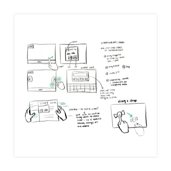
Sketching initial thoughts
We started to sketch ideas based on our user research. We played with simple gestures and fun interactive screens.

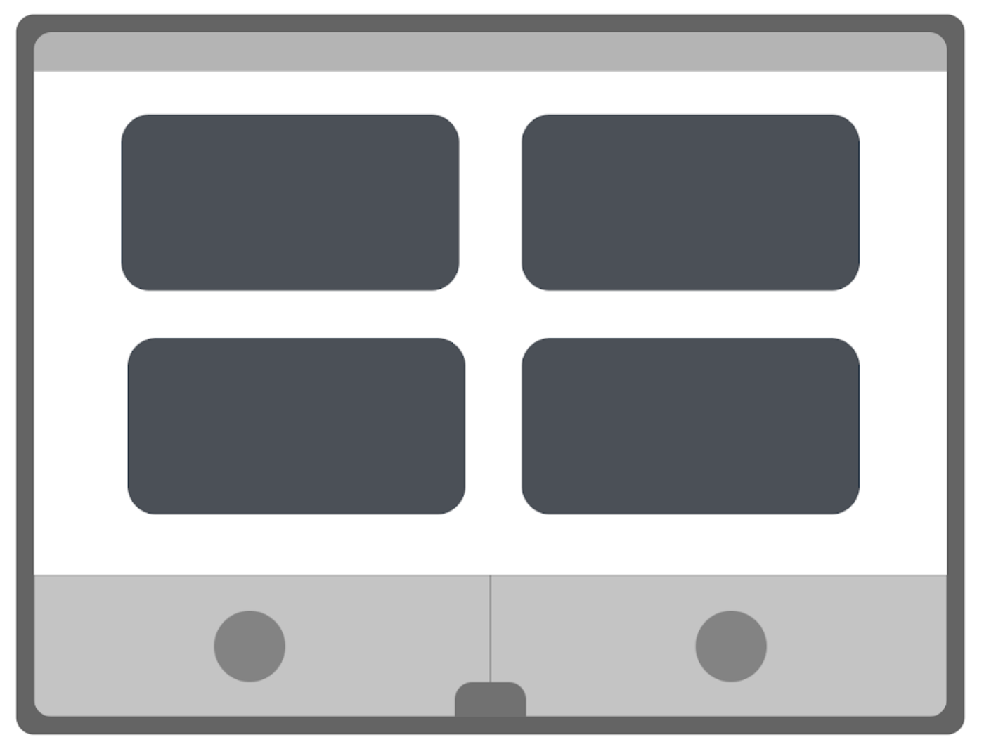
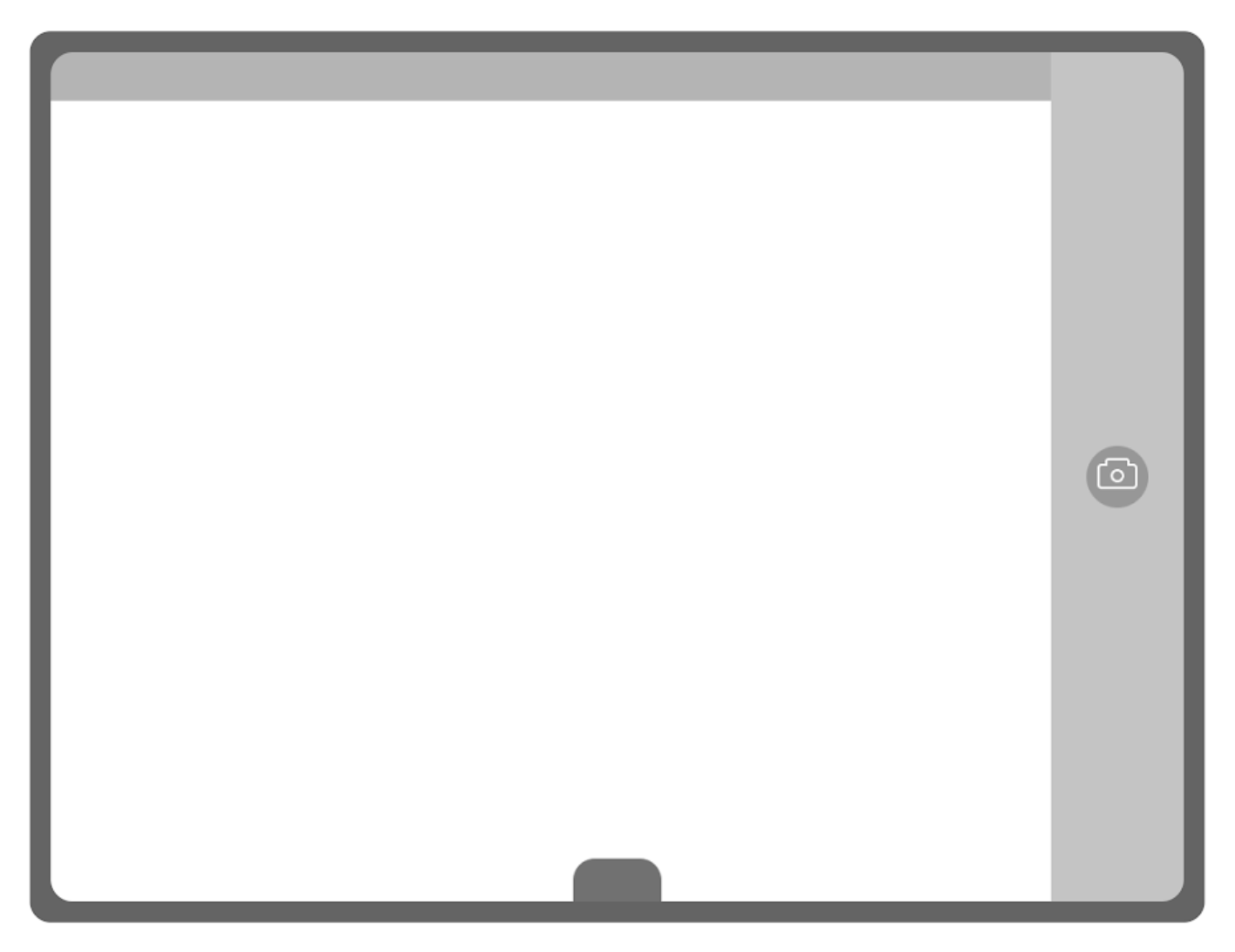
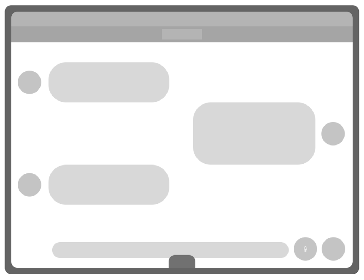
Lo-fi wireframes
After sketching, we continued on with our design process by creating lo-fi wireframes. We focused on conventional layouts that would support future devices that children may use and made sure to simplify them.

Let’s make it official.
It was time for us to settle on the typography, colors, and components of our UI. In terms of the font, we wanted a modern yet friendly-looking font with rounded corners. The colors are vibrant, something that research showed to retain attention of children more. We chose rounded corners as it creates a playful effect rather than traditional 90-degree corners.


The final product
After a dozen late nights, team meetings, and presentations, we finally had designed a full operating system.

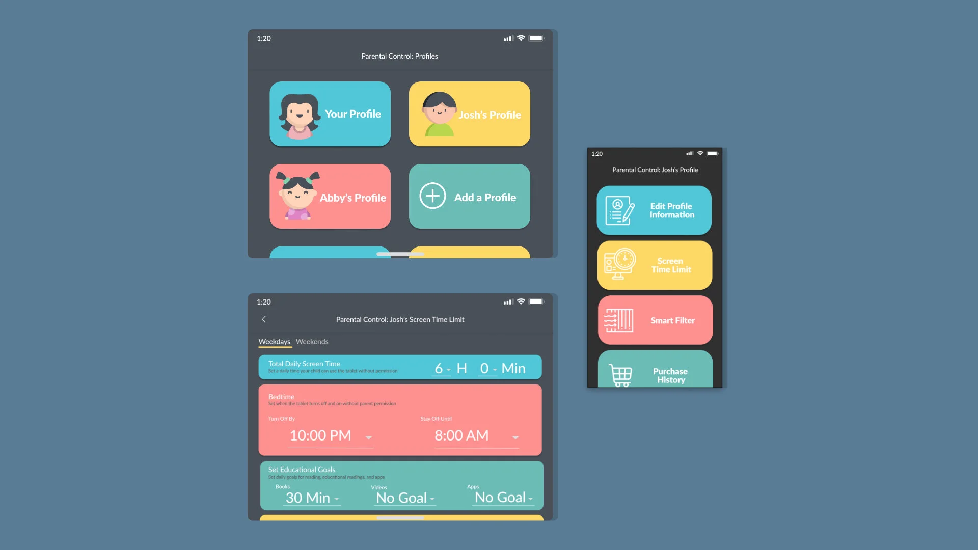
LOCK SCREEN & SPRINGBOARD
The idea of this OS is to create a simple interface, similar to current market devices but simplified for children. The lock screen will ask for a “high five”, prompting the user to tap the screen, while simultaneously using face recognition to unlock the device. The springboard is a 2x3 grid of icons, showing an image and text below to help children make connections between words and images.
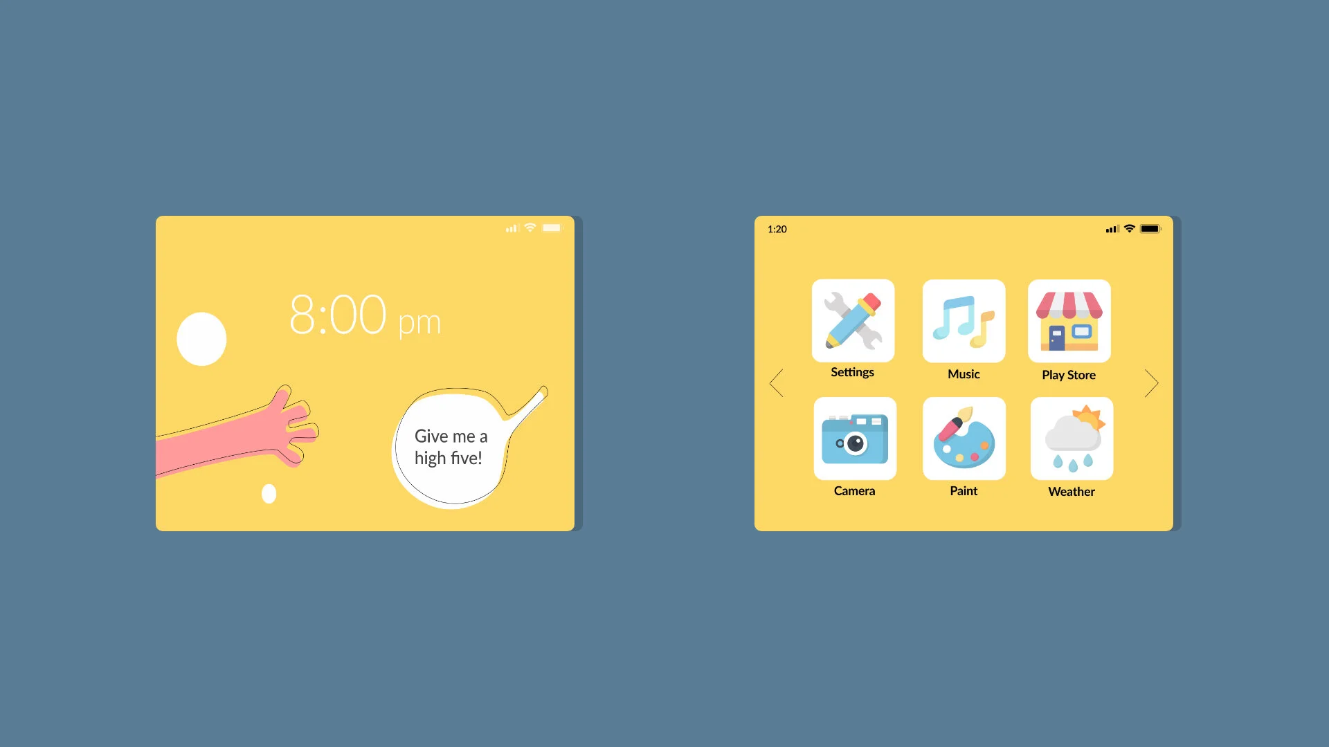

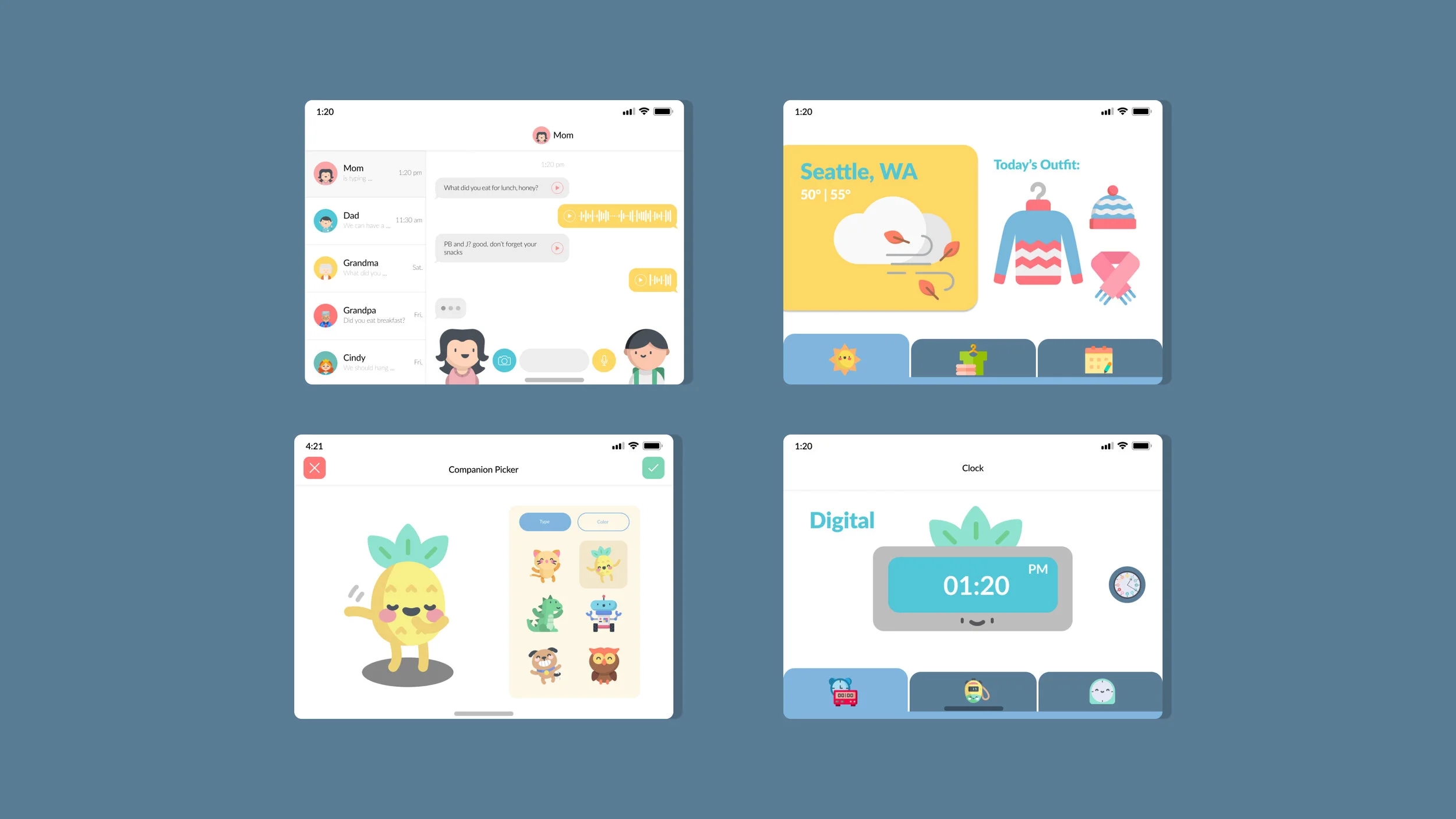
APPLICATIONS
Here are a few applications that would be included in the os. All of these applications are simplified versions of the typical app, allowing ease of use while including full functionality.
Messages – Includes speech-to-text technology to help children who cannot read yet, understand text messages but listening to them aurally
Weather – Provides a visual representation of the weather, with a suggestion of what to wear
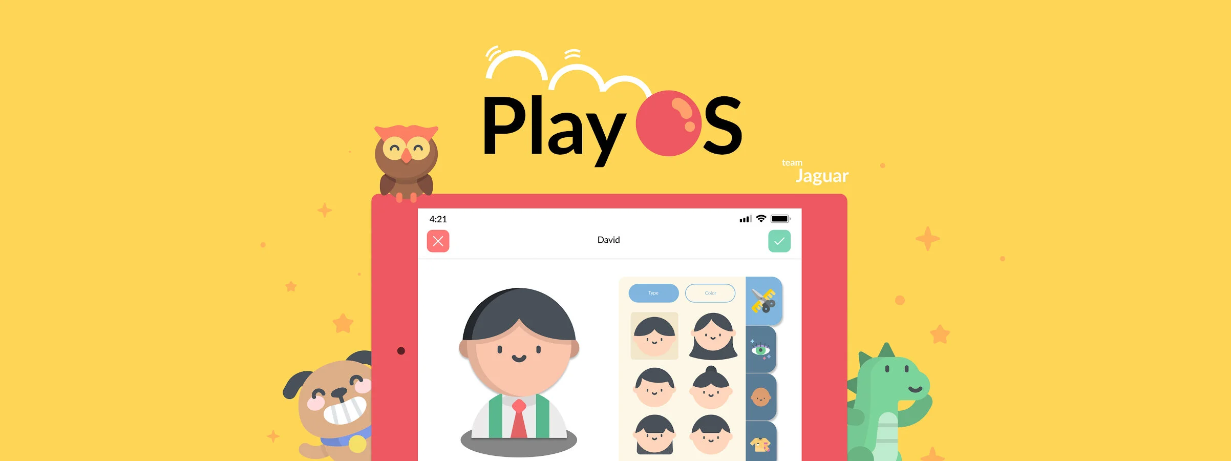
Companion – Allows users to create a digital companion to guide them through the OS
Clock - Includes both digital/analog clocks with audio to help children comprehend.

PARENTAL CONTROLS
By research on the current market devices, we were able to compile features that resolved many complaints.
Profiles for different users that can have a variety of restrictions
Include smart/manual filters
Access and review child usage on another smart devices by linking
Moving forward
User testing
Expand library of educational apps
So what did I learn?
This project required exploration in realms that I had never thought about. The idea of designing a product for children but targeted towards parental figures was the most challenging part. It required my team to think about two intended audience groups while maintaining attraction to both parties. From this project, I believe sufficient user research is what sets a design apart from good to great. By conducting hours of user research, we were able to determine what each audience group needed.
The power of teamwork shined when we designated roles such as user researcher, market researcher, and designers. We found strengths in each other and delegated our work through this. The process of bouncing ideas off of each other something I greatly appreciate. The efficiency of our collaboration was the only way this project came about. Within 10 weeks, I learned an incredible amount of technical skills, communication skills, and presentation skills. I love working on these projects, teaching me invaluable soft skills.
